Saturday 23 October 2010

Film Magazine draft/layout

Layout 1:

LEFT SIDE OF A3 SPREAD
* Close up of the main protagonist
* 4 small screen shots i the foreground of the image.
* Title of the film. 

RIGHT SIDE OF A3 SPREAD
* Image relevent to the review 
* Quote from the film dividing the text.
 
Layout 2: 

LEFT SIDE OF A3 SPREAD
* Two columns of text
* Logo of the magazine
* Image of the protagonist out of character.
* Statistics about the film

RIGHT SIDE OF A3 SPREAD
* Three columns of text 


Layout 3:

LEFT SIDE OF A3 SPREAD
* Image of the main protagonist
* The main quote from the film in fancy written

RIGHT SIDE OF A3 SPREAD
* Title of the film in top left hand corner will be in the same font as on the poster.
* Three columns of text for the review
* The text will be divided (75% down from the top) by a star rating and the name of the companies rating it.
Layout 4:

LEFT SIDE OF A3 SPREAD
* A poster will be displayed taking up the left hand side.

RIGHT SIDE OF A3 SPREAD
* Two columns of text.
* Image ( screen shot from the film )
* Quote from the film.

Friday 22 October 2010

Poster Drafts (PLANNING AND ORGANISING)


For this poster design the main aim was to fit in with the conventions of the short film. The title will be in grey. 
The characters will be in black and white with a blue tint applied. The tag line will be in red.
Images of the two characters will show conflict between the two.

* The Big bold title is to catch the attention of the audience. The city within the title will insinuate the location for the film 

* The most interesting aspect of the poster will be the eyes of the character which will be kept in normal colour to depict his anger and rage.

* The  poster will be landscape 

* The poster will show some company logs which tell people what companies that are involved in the production of the film.

* The film will have a tag line ‘LET ME DOWN THE KID DIES’ the tag line wraps up the storyline in a sentence.

* The poster will not show a release date for the film which will create anticipation.

* Billing/credit block 

* The lead roles first name will be smaller, to tell the audience who is in the film.

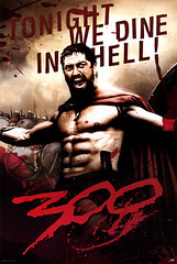
For this poster design the aim was to show all the characters in the film presented in a V shape with the main protagonist being at the front. This poster would have information than the previous. The title would be in 'blood' red. The characters would be in black and white with an effected added in the photoshop process. The tag-line would also be in red.

* The Big bold title is to catch the attention of the audience. The city within the title will insinuate the location for the film. 

* The poster will be portrait.

* The poster will show some company logs which tell people what companies that are involved in the production of the film.

* Billing/credit block

* The poster would show the release date
For this poster design I used a technique I saw on one of the godfather posters which just displayed the protagonist using the rule of thirds on the left side minupulated in photoshop. The Title would be in bold white or red. The tag-line would also be in red or white. 

* The Big bold title is to catch the attention of the audience

* The poster will be portrait

* Billing/credit block

* The film will have a tag line ‘LET ME DOWN THE KID DIES’ the tag line wraps up the storyline in a sentence.

Pictures of me drawing my drafts and ideas for my film poster 


Thursday 21 October 2010

Fonts for poster/magazine review


 I have chosen five Sans-serif font (typeface which does not have the small features called serifs at the end of the strokes) and  two Serif fonts. This is due to the fact that are used more for headlines than text in articles for example. I understand that Serif fonts attract the viewers eye and allows them to read the text more easily, however I will compensate this by using a large bold font, so the name of the film can easily be identified.

Serif and sans-serif 02.svgSerif and sans-serif 01.svgSerif and sans-serif 03.svg

Casting news 2 (PLANNING AND ORGANISING)


Great news found my next actor who helped me previously with producing a music video he is my good friend Tyrone who will be playing the main protagonist Alan Johnson. All our conversations will be recorded on the call log. Just need to find 4 more actors its a good start so far.

Wednesday 20 October 2010

Props (PLANNING AND ORGANISING)

A theatrical property, commonly referred to as a prop, is any object held or used on stage by an actor for use in furthering the plot or story line of a production. Smaller props are referred to as "hand props". Larger props may also be set decoration, such as a chair or table. The difference between a set decoration and a prop is use. If the item is not touched by a performer for any reason it is simply a set decoration. If it is touched by the actor in accordance to script requirements or as deemed by the director, it is a prop.

Sunday 17 October 2010

Locations (PLANNING AND ORGANISING)

A filming location is a place where some or all of a film or television series is produced, in addition to or instead of using sets constructed on a movie studio back-lot or sound-stage.

Location filming has several advantages over filming on a studio set:
  • It can be cheaper than constructing large sets
  • The illusion of reality can be stronger - it is hard to replicate real-world wear-and-tear, and architectural details.
Its disadvantages include:
  • A lack of control over the environment - passing aircraft, traffic, pedestrians, bad weather, city regulations, etc.

I used Google Maps to look at were I could film some of the shots for my film.


Location 1: Street


I will be shooting the opening scene on the street this is were most of the Dramatic scenes will take place such as the kidnap of Alan Johnson's daughter and death of his wife.  


Location 2: Bedroom (Alan Johnson's room)

This Location will only be briefly in the short film as this is were Alan Johnson runs out hearing his child and wife screaming. 


Location 3: Dining Room (Tommy Desaranno's office)


This Location will be were Tommy Desaranno dictates what he wants from Alan Johnson this is were the audience find out why the film is called the Five W's and one H

Saturday 16 October 2010

Casting news 1 (PLANNING AND ORGANISING)


I  intended to begin filming in October half term, so I started to try an get all the major roles pinned down by the end of the week. I have approached one of my friends Anthony who has confirmed that he will play the part of Tommy Disoronno. To check out what we discussed check my call log which I records all our conversations reguarding filming and preparation. The rest of the cast is yet to be confirmed. !!!

Friday 15 October 2010

Animatic

I feel my basic animatic effectively showed me  the vision I had for my short film. The editing style and pace effectively creates the mood and feel I had imagined. The use of close ups and mid-shots meets the codes and conventions of short films as well as the use of sound and narrative created through these techniques. Although it is not around five minutes it shows the basic structure of my film.


Story Board (PLANING AND ORGANISING) PRE-PRODUCTION


Script Development (PLANNING AND ORGANISING)

 I looked at the first draft closely and noticed flaws and gaps in the narrative. I needed to produce other ideas as I was not clear about how it will end. After reading the script in great detail I realised fr a short film it would be very difficult to communicate the narrative without the viewer having to watch it numerous times.

Wednesday 13 October 2010

Call Log

I will be recording all my calls, texts and emails, I will be making to my actors for the short film and any other people who will be aiding me in making it. I will be continuously updateding my call log.

CALL LOG

Date: 7th October 2010

Time: 15.34

Communication: Call

Called one of my friends if would if he would like to play the main antagonist Tommy Disaranno. I explained the storyline and like the sound of it as he is already a big film fan. I told him the script will be complete in a week so he has time to learn his part.


Date: 11th October 2010

Communication: Call

Called Tyrone who said he would to play the main protagonist Alan Johnson. I also explained the storyline and the parts he would be playing. I also told him the script will be completed in a week so he could learn his part

Monday 11 October 2010

Evaluation Of Research

I believe the research process has had a significant positive effect on my planning ,as my secondary research has given me a good understanding of the codes and conventions of a short film. By looking at existing media products, I now have a solid understanding of the narrative structure of short films. This research has influenced me to base my product on Barthes engima code such that narrative isn't created in a linear form however through a "series of mysteries" in which to be solved by the audience.

Subsequently I have decided to incorporate an aspect of real life and drama into my piece. As a result this reduced the choices available to from my Inital ideas. I believe this had an effetive impact on my genre choice to which will appeal to my target audience and significantly improve my overall product. As a result my research, shot choices, editing style and mise-en-scene will be considered greatly when it comes to creating my animatic and rough cut.

Hegemony Dominant Ideology

Ideology is the system of ideas, values and beliefs which an individual, group or society holds to be true or important; these are shared by a culture / society, or groups in a society, about how individuals should function.

Hegemony, on the other hand, describes the general consensus of an organisation to be the most believed or referenced .  In terms of news hegemony, most people will tend to trust and believe the news of the BBC when comparing it to other sources because of their firm ideological commitments.

Multimodality

Multimodality

In terms of films it is difficult to simply put a film in a specific genre because it is made up of a range of different media elements.

Kress and Van Leeuwen (1996) offer a theoretical approach for multimodal analysis.  Looking at texts this way we need to:

1. Identify the medium (or media) chosen for production

2. Identify the modes of communication chosen for the design of the text

3. Identify the various ways in which the text is distributed

4. Identify the kinds of discourse being communicated (the dominant representations of people and the world).

Films are multimodal because of their reliance on combinations.  It is helpful to use a theory like this if we think the kinds of media texts we are dealing with are more complex and involve more combinations (mainly due to technology and new audience behaviour) than the traditional concepts of Media Studies can deal with.

Sunday 10 October 2010

Film Magazine review analysis (RESEARCH AND PLANNING)

This magazine review is for the 'I AM Legend' film which is a science fiction film. The main image is not a still image from the film instead they used an image from the production stage which indicates the review is more about the technical making of the film and how the actor had to adapt to the role. The magazine  is an A3 spread and the main image takes up 2/3 of the page and bleeds to the end of the page. The beginning of the article starts with a bigger letter in this case 'R' which is conventional on majority of magazine articles. The title fits with the layout and design of the page and is in bold and also a different colour from the rest of the text. The text is typed in columns (conventional), the review has statistics such as how much the film cost to produce, the companies involved etc. The text has been placed on boxes which overlap the main image. 

This magazine review is for the girl with the dragon tattoo which is a crime/mystery film which was once a novel. The style of the page represents the genre of the film. The 'W' is in a large dragon/ asian style font. Having a large letter to starting at the begging of a review pahe is conventional. The poster shows images from the film and during production. On the left hand side or the trilogy novels so the audience know that the film was once a book. The image at the bottom of the page shows what the title of the film is called a 'Girl with a dragon tattoo'. The images do not bleed of the page, at the top of the page there is a graphic that also coincides with the theme of the film. The text is in one column which is dived by two subtitles in different fonts from the text. There is a small box image of the protagonist, the main colours are beige, white and black.
This film review is for the film sanctum which is a 3D action thriller film, the review is simple but effective. The review is a pre release review the review does not display the title of the film is instead it has in block capitals 'dark water'.The main image is a diver which seems to underwater at night the character is looking directly at the viewer as if he is going to burst out the page this creates the effect which is seen in 3D films.
This review magazine is for the film Black Swan which is a physcological thriller.
the poster has two columns and has the conventional large letter 'F' starting the article.
The poster is dominated by a white background with added graphics of three feathers which relate to the film.
the quote is in  red block capitals which stands out against the white background and reads " I TRY TO DO THINGS THAT SCARE ME, BUT I DIDN'T REALISE WHAT THIS WAS GONNA BE LIKE"


The review magazine is for the CGI film AVATAR. The magazine review uses a few screen-shots from the film as the film is more based on visual entertainment than narrative. The page is an A3 spread and the images are arranged in a linear manner with a boarders around them. The images show the mordern CGI effects  and what is believed to be the most interesting or key events from the film. The review page consist of one main image with the two main characters, a smaller ajacent image with a character in action, and two smaller os images along the the bottom. The images tell the target audience what genre the film it is. The images do not overlap each over however the text boxes overlap the images. The text uses consistent font and size exept for the title which stands out in a bolder font. The text is the same colour throughout the article. The beginning of the article starts with a bigger letter in this case 'J' which is conventional on majority of magazine articles. The title fits with the layout and design of the page.

Saturday 9 October 2010

Film cast interviews (SAW 3D)


I watched this video for ideas of what to write in our article.

Film cast interviews (Chris Nolan - Director of Inception & The Dark Knight Rises)


I watch this video so I could get some ideas of what to include in the article from a directors point of view

Similar Review magazines


I will be researching Film review magazines, the design, layout and conventions and apply the theory to my magazine review 


Codes and conventions of a short film magazine review (RESEARCH AND PLANNING)

The general code and conventions of a film magazine may vary but having doing research and analysing some film magazines I have come to discover majority of them will

- Suggest the genre of the film so that the right audience, will view the film.
- Displaying famous actors to promote the film.
- Attract the target audience.
- A main image,
- A secondary image (but not necessary)
- An overall rating of the film,
- A clear title,
- Tag line
- An overview of the film.

Short Film Poster Analysis (RESEARCH AND PLANNING)


I put together a collection of short film  posters to have a general glance and the conventions.

The Lethal Innocents

"Rita, a 15 year old girl who dances to a different beat, is relentlessly bullied by the queen bees. When they kill her cat, they go one step to far."

The main focus of the poster is of the lead character Rita, who is placed centre in centre of the frame. The depth of field has been utilised to blur the characters in the background. This technique makes her stand out from the crowd and also shows the divide between her and the girls socially. This reflects her character in the film and the way she is represented in the film. The fact she is framed in the centrally and her image takes up a large proportion of the poster shows her importance to the film. In addition her gaze is directly at the viewer. This eye contact combined with her facial expression creates a sense of unease in the viewer as if we are against her aswell. The above techniques provide the viewer with an insight to the genre and feel of the text.

The title of the film is placed midway down the poster. The title is in capital letters, the characters of the letters are not filled in which could represent an emptiness when her cat, which we presume means a lot to her is killed. The misaligned, almost hand drawn, title further reflects how the character doesn't conform to the norm of society. Thus the audience is shown the personality of the character and due to conventions of genre, the audience can depict from her character profile that the film will be of the psychological drama genre, this aspect can be seen in my short film

We can see the contrast between the Rita in the foreground and the girls in the background rita has short blond hair and her facial expression shows anger and fasturation wile on the other hand the girls in the background are brunette with long hair and their facial expressions are sneaky and

The film has a biling blog showing the actors, director(s) and everyone who was involved in the production of the film. I dont think any photo minuplating software was used on the image as it is simple natural but still effective.

Film Poster analysis (RESEARCH AND PLANNING)


A film poster is a poster used to advertise a film. There are usually more than one versions for one film, with variations in regards to size, content and country of production of the poster. It usually contains an image with text, though this has evolved over time from image-free bill posters through to the highly visual digital productions of today. 


The text usually contains the film title in large lettering which attracts the eye, bold colours which stand out from the background, and often the names of the main actors for promotion. It may also include a tag line to persuade the viewers to go and see the film, the name of the director, names of characters, release date and the certification which will ensure that the right type of people are watching the film.


Film posters are displayed inside and on the outside of cinemas, and  on the street or in shops. The can also appear  on websites, flyers, advertisements in newspapers and magazines.


Use of film posters goes back to the earliest public exhibitions of film, where they were outside listing the programme of short films to be shown inside the hall or movie theatre. 


An example of how different types of film (e.g. comedy, horror) poster use these forms and conventions to attract a certain type of person (e.g. teenagers, horror fans) would be a really scary horror film, which will use eerie images in order to appeal to horror fans. 


A successful film poster will accomplish attracting the target audience and persuade them to come and watch the film. 

Similar Film posters


I  have looked at numerous film posters not only from the action/drama genre but from a range of genres as well. Looking at all the posters it is obvious that I will need to manipulate the original images to a degree to get a professional and conventional look. so I plan to cut the images using photoshop and use a number of effects to give the image a dramatic look, this is conventional for this specific genre of film.

(click on the posters for examples which are all annotated)


Valkyire


The Dark Knight300


The Expendables

Codes and conventions of a film Poster (RESEARCH AND PLANNING)

The general code and conventions of a Poster vary but having doing research and analysing a range of posters I have come to discover majority of posters will


- Be eye- catching and captivating this means were the poster is set for the audience it will grab there attention and make them want to go and view the film.
- Have an image that will be intriguing 
- Display a large title that can be easily read by the audience.
- Suggest the genre of the film so that the right audience, will view the film.
- Displaying famous actors to promote the film.
- Attract the target audience.
- Have a tag-line
Coming soon or release date displayed.
Directors and Production Company displayed. 

Friday 8 October 2010

Target Audience views Justified (RESEARCH AND PLANNING)

Having finished analysing the target audience research I have justified that the taget audience for Five w's and one H is quite diverse depending on the angle the audience want to recieve the text. It will not appeal soley to one age specific audience. My intial throughts was to aim at the teenage/ young audience who watch programmes like law and order etc . Having conducted all my research I found this is correct. 

The short film would be advertised through websites such as Facebook, Twitter and BBC Film as this is were a mojority of the audience would view the text as it is increasingly popular with that age group. I realised that the audience I am focussing on could be potentially much broader.

Anyone who has done wrong and is "trying to turn a new leaf" or has or had a stressful life that posssible impacted with their family would be able to identify with Alan and his struggle.

Hence, I divided the target audience into two:

* Teenages and young adults, who are fans of films such as Die hard, law abiding citizen or TV shoes like the bill, law and order UK would enjoy the action packed or dramatic conclusions.

* Persons of any age who can identify with Alan's struggle and mistakes.

Saturday 2 October 2010

Questionnaire short film poster (RESEARCH AND PLANNING)

Below are a few questions relating to the design of posters and how we as individuals and as a society react and respond to posters around us.


Question 1.

What do you take notice when looking at posters when you go out and about ?

Question 2.

If a film poster catches your eye, would you go and see the film solely for this reason ?

Question 3.

If you see a product advertised in a poster (chocolate for example), would it entice you into buying the product ?

Question 4.

Have you ever seen the poster pictured below before - not the slogan but the imagery ?

Question 5.

What three main colours would you expect on a dramatic film poster ?

Question 6.

What characters would you expect on the film poster

Question 7. 

Would you expect the main location or were the film is set on a  poster for a dramatic film ?

Question 8.

Would you expect the release date on a film poster ?

Question 9.

Do you think a teaser and other types of posters are necesarry ?

Question 10.


In just a few words, what would your definition of 'poster' be?


Thank you for your time.

Anthony Adewunmi

Friday 1 October 2010

Questionnaire Short Film (RESEARCH AND PLANNING)

I gave out 30 questionnaires for Primary research to my target audience, 20 on a social networking site (Facebook) and the other 10 by hand, the questionnaire would aid me in making crucial decisions in what features, themes and visuals to include when producing my film.


I used multiple questions so that it would be easy to get simple but effective answers. The questions are designed so I could see what themes, locations, and  target audience would view the film and how the  film should be presented e.g colour/ black and white.  


Screen shot of me sending out questionnaires on Facebook.